Londoners are travelling around in a state of fear. There’s a threat looming that can take all your monies and ruin all your journeys. Or at least that’s what Transport for London (TfL) seems to want you to think when they warn you of the terror that is “Card Clash”.
If you don’t know what card clash is, fear not, it’s actually very simple. Card clash occurs when you put two or more contactless payment cards (one of which may be an Oyster card) onto a card reader at once. In this case, that means those yellow blocks on the barriers at tubes and at the entrance to buses. Should this apparent travesty occur, one of several things might happen. You might:
- have payment for your journey taken from a card other than the one you intended
- need to re-swipe your card, as the reader can’t read any of the cards at all
- be totally fine and sail through as normal
Not so terrible, really. What the card clash slogan is trying to do is make you exercise a bit of common sense. But it’s going about it all the wrong way. And I’m going to tell you why.
Start with needs
There’s a bit of a revolution going on in government at the moment. You might have heard about it. The Government Digital Service is changing, not only the way government does digital and technology, but it’s also challenging the way people think about engaging with service users in the broadest sense. They created a set of design principles, and they have the potential to apply to a lot more than just digital services. The first principle states:
Start with needs*
That’s not all:
*user needs, not government needs
It’s a pretty powerful idea. Instead of thinking about the ways government can get what’s best for them, GDS is challenging government to think about what citizens want.
By putting user needs first, users can have a “simpler, clearer, faster” experience. They can get what they want, and government can still get what it needs.
So what? Well, for starters, it doesn’t just have relevance to digital services. Any organisation, delivering any kinds of services, can benefit from this thinking.
Had TfL thought about user needs, they wouldn’t have ended up with the ridiculous card clash brand.
Why does card clash fail? Buzzword Bingo Bonanza
Principally, card clash fails because it’s jargon; needless buzzwords that could have been articulated in a simple sentence. This kind of language isn’t putting user needs first. It’s inaccessible and confusing for users, and makes organisations like TfL lose trust.
The fact that card clash is a term that needs to be explained to be understood should have told TfL that using it was a bad idea.
And it’s not like they needed the brand. There won’t be instances where you’ll see tube users chortling to themselves, “oh card clash, you rogue,” as their cards behave badly at barriers. Card clash isn’t going to become part of popular vernacular like “‘sup dawg”. It didn’t need a brand for people to get annoyed at it happening.
Card clash needs fixing. According to TfL, around 2,000 Londoners a day are falling victim to the phenomenon. And yet, in its current state, most of them likely don’t even realise it. We need a better way to tell people how to use their everyday technology to get around London.
Fixing Card Clash
This whole card clash brand could have been so different. TfL could have just used simple messages to tell people to keep their contactless payment cards separate.
TfL’s current messaging fails so badly because it doesn’t actually say anything. Card clash is an empty phrase. By using simple, directive language, TfL could get what it wants – people to separate their cards – and users get what they want – a speedy journey and a correct payment.
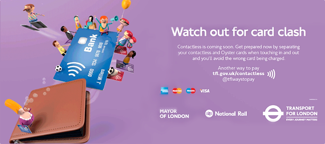
Above is an actual piece of TfL branding. The problem is that “Watch out for card clash” means nothing. It’s using jargon without explanation. So why not ditch the brand, and simply say this:
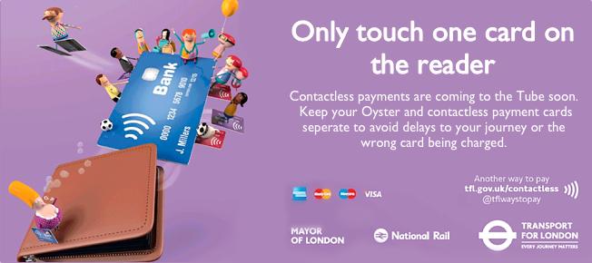
Here’s another example:
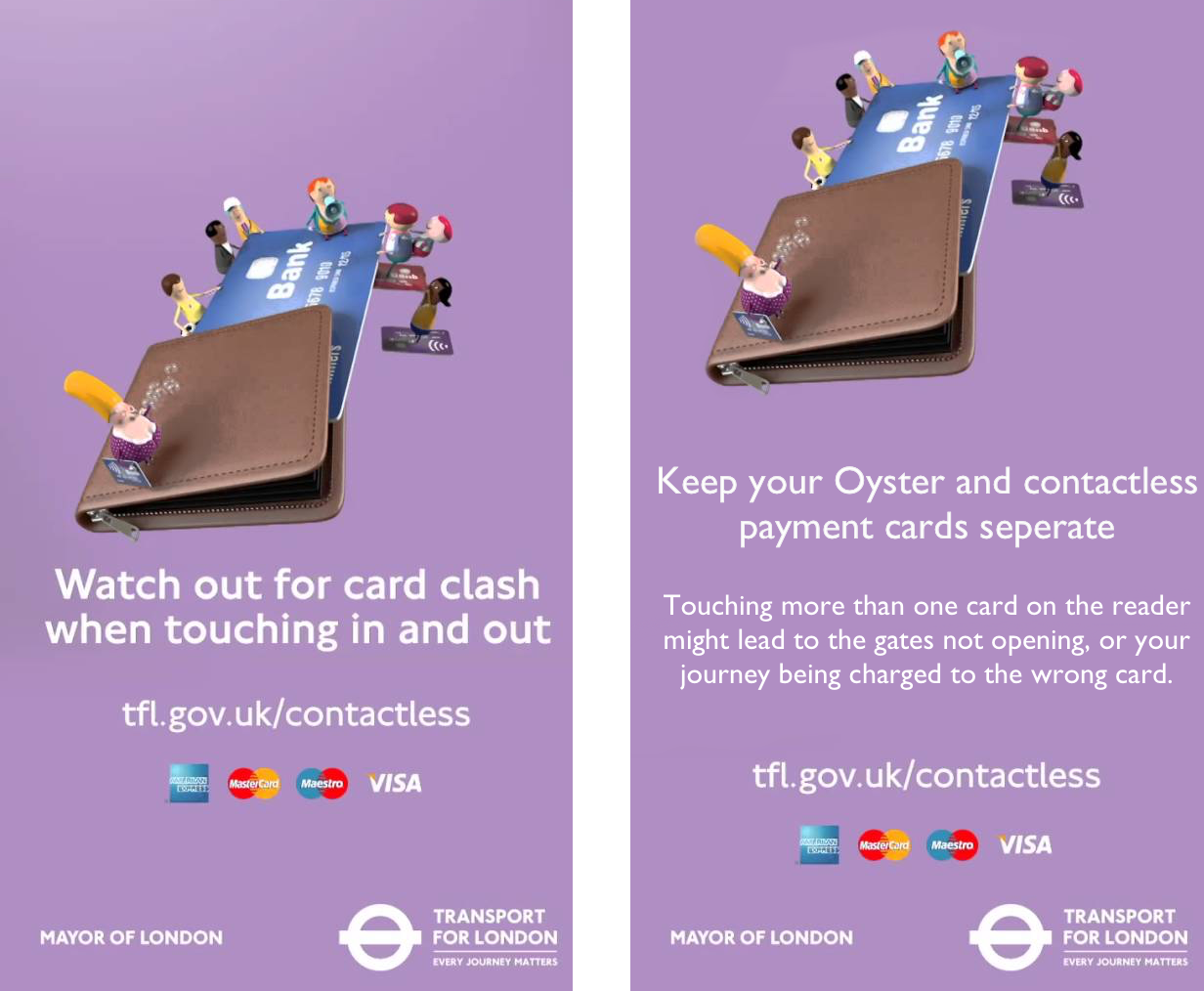
Ignoring this example of a blatant and needless branding exercise, TfL did get very close to something that was simple elsewhere; infuriatingly close in fact.
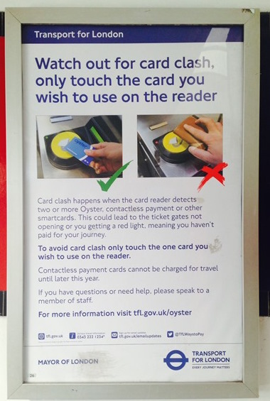
Look at this poster (above). It’s been displayed in tube stations across the network for months. It uses the term card clash, and it also explains what it is (albeit in a convoluted manner).
Importantly though, it does explain it. Fixing card clash wouldn’t be hard for a TfL marketing person. All it takes is a red pen, and a little imagination.
Putting user needs first, we might have ended up with something like this:
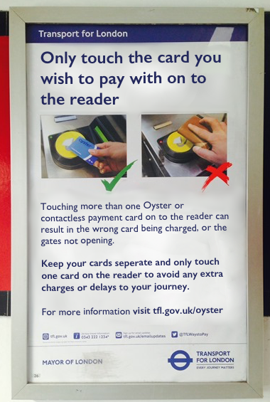
Again, no branding, no marketing effort. Just simple, straight-forward language.
Simpler, clearer, faster
By removing the phrase ‘Card Clash’ from the equation, TfL’s message could be “simpler, clearer and faster”. TfL don’t need card clash to get what they want from it. In fact, I’ll bet that card clash is the result of a senior manager saying to a PR team that “it needs to be more branded“. People assume that a strong brand is always the best way to get a message across; but here, the brand is just redundant.
Maybe Transport for London should heed another of GDS’s design principles: do less.