In case you haven’t heard: the world runs on data.
Government loves data. Departments are swimming in it.
Policy data. Operational data. Delivery data. Demographic data.
Put enough civil servants on a problem and, much like Shakespeare-writing monkeys, eventually they’ll start making spreadsheets. Inevitably, that spreadsheet will probably reach a boardroom.
Trackers, dashboards, reports; they go by many names. They have one thing in common: they’re mostly useless because they’re not actionable.
Actionable data
Actionable data is immediately understandable, and it makes it obvious what to do because you’ve got it. It’s probably derived data, not raw, and it’s contextualised against other meaningful data.
Here are some ideas for making management information better:
Show progress and a trend
Actionable management data enables you to see where you are, and where you’re going. There are a lot of ways to show this; most of them are numerical, involving percentages and ratios.
The point is that your data should allow you to compare the current state of today’s delivery against the expected end result. That’s useful because you know where you are in a journey and how far you’ve got to go.
Useful data needs to be relative if it’s useful for decision making; you don’t just want to know where you are, and where you’re headed, but also where you expected to be. Actionable data has a baseline and a trajectory, and we’re monitoring velocity to get there.
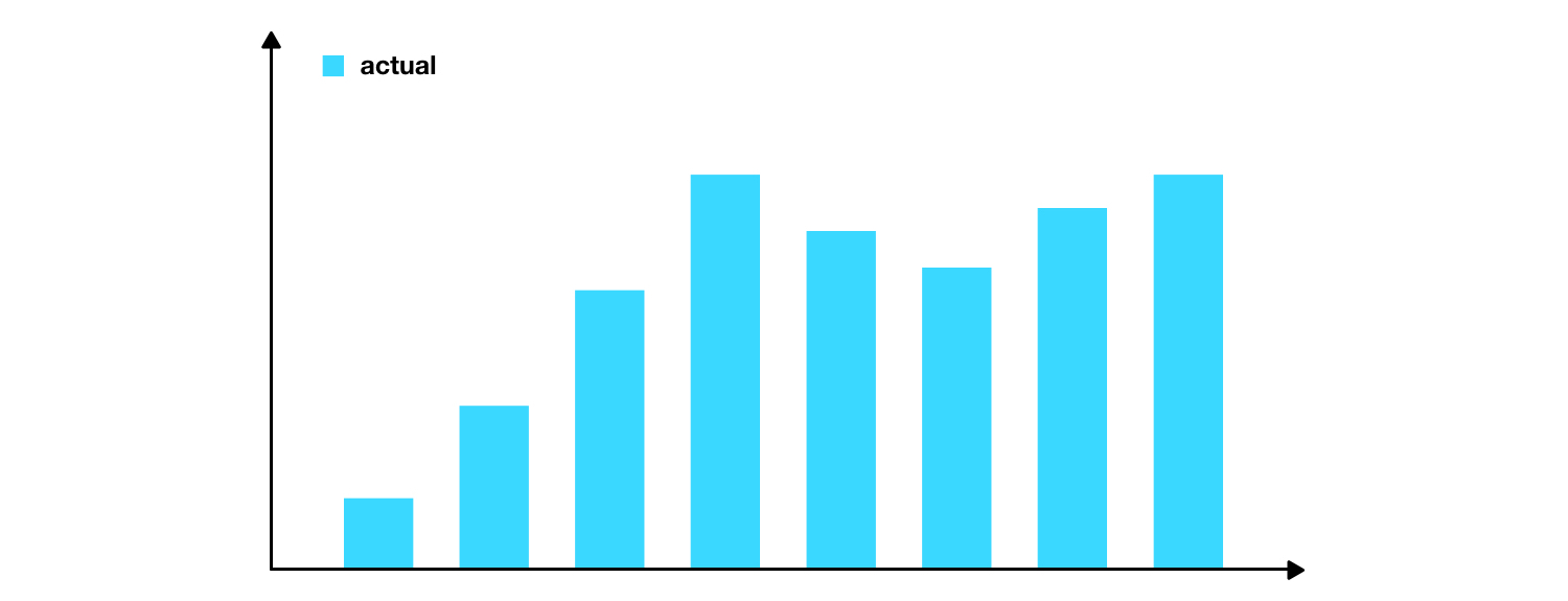
Data should look less like this:

And more like this:

Be immediately understandable
Data should be comprehensible at a glance. Anything that obscures your understanding will obscure your decision making process.
RAG ratings are the enemy of decision making.

You might be thinking, “but everyone uses RAG ratings”, and they do but ask yourself this: what’s the quantifiable difference between amber and amber / green?
There isn’t one; or at least it’s different to everyone you ask. That’s because the distinctions are completely arbitrary - they’re colours, not metrics.
If you need a key to understand your data, you blew it.
Show context
Numbers need to be contextual to show where action is required. Don’t present numbers in absence of information needed to make it meaningful.
If you’re generating sales, show your sales relative to the potential sales.
If you’re showing recruitment data, show your actual recruitment against you’re expected recruitment.
Never present a number as though it’s a panacea. Be honest about its limits.
Measure the whole thing, not just the bits you can measure, and if you can’t, make it obvious what is being measured.
Don’t present data for comparison if the basis for getting to that number is different.
Be timely
Data should be timely; which means it’s available when it’s needed, but also that it’s reported at meaningful intervals.
Don’t present data to a Board about project delivery weeks after it starts. It probably won’t be useful and it definitely won’t be indicative of trend.
Explain anomalies
Don’t leave anomalies unexplained. If it’s erroneous it’ll distract from the conversation you want to have. If it’s not, it needs to be explained so you can do something about it.
 John Peart