I recently upgraded my phone. A less exciting activity than it used to be, admittedly, but this new iPhone 15 Pro Max comes with a new button! The Action Button. I’ve been playing around with Apple’s Shortcuts app, to see how useful I can make it.
A fast track to your favourite features
The new Action Button replaces the ring/silent toggle switch from previous iPhone generations. Apple describes it as a “a fast track to your favourite feature”. Press and hold the Action Button for a few seconds and it will trigger an assigned action.
You can assign it to trigger one of 9 different functions: Silent Mode1, Focus2, Camera3, Torch4, Voice Memo5, Translate6, Magnifier7, Accessibility8, or Shortcut.
A way to trigger almost anything
That last one – Shortcut – is the special sauce.
A Shortcut is a customisable set of actions that you can programme with low or no coding. They can be simple – opening an app, or locking the rotation of the device – or more complex – like displaying a customised weather forecast, handing off music to a set of speakers in your living room and kitchen.
A Shortcut can do almost anything you might need on your device9. That means you can have your Action Button trigger everything you might actually want: a lot more than just toggling Silent Mode.
Ah, another menu. Revolutionary.
By default, you can make the Action Button run a single Shortcut or open a folder of Shortcuts.
It felt like a waste of a whole-new button to have it do just one thing, so I’ve been experimenting with the latter.
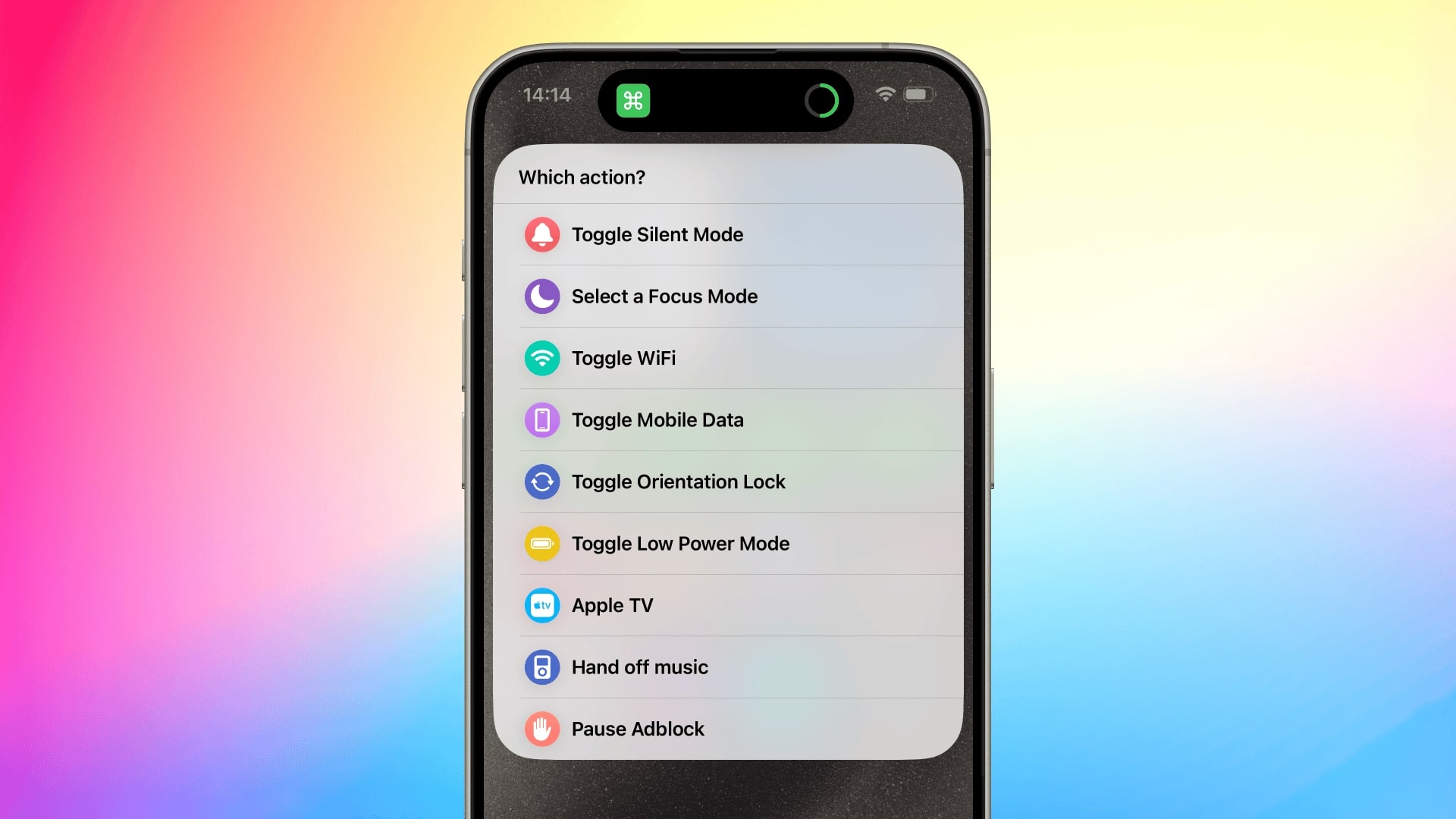
I’ve set up new Shortcuts for pausing my ad-blocker, turning on or off my Apple TV, toggling mobile data and, yes, activating Silent mode. I quickly discovered that I had more Shortcuts I wanted to include in the list than the default Apple menu would let me have.

But I was not deterred by Apple’s refusal to accept that numbers do, in fact, go past 8. I built my own menu instead.
Plenty of people have been doing this online – just look at Reddit – but they’ve been using the built in Choose from Menu option. This works fine, and I did that too at first.
But the longer the list gets, the harder it is to distinguish between the options at a glance. I could do what others had done and add some emoji, but I wanted something that had a bit more visual pizzazz.
More beautiful menus by hacking contact cards
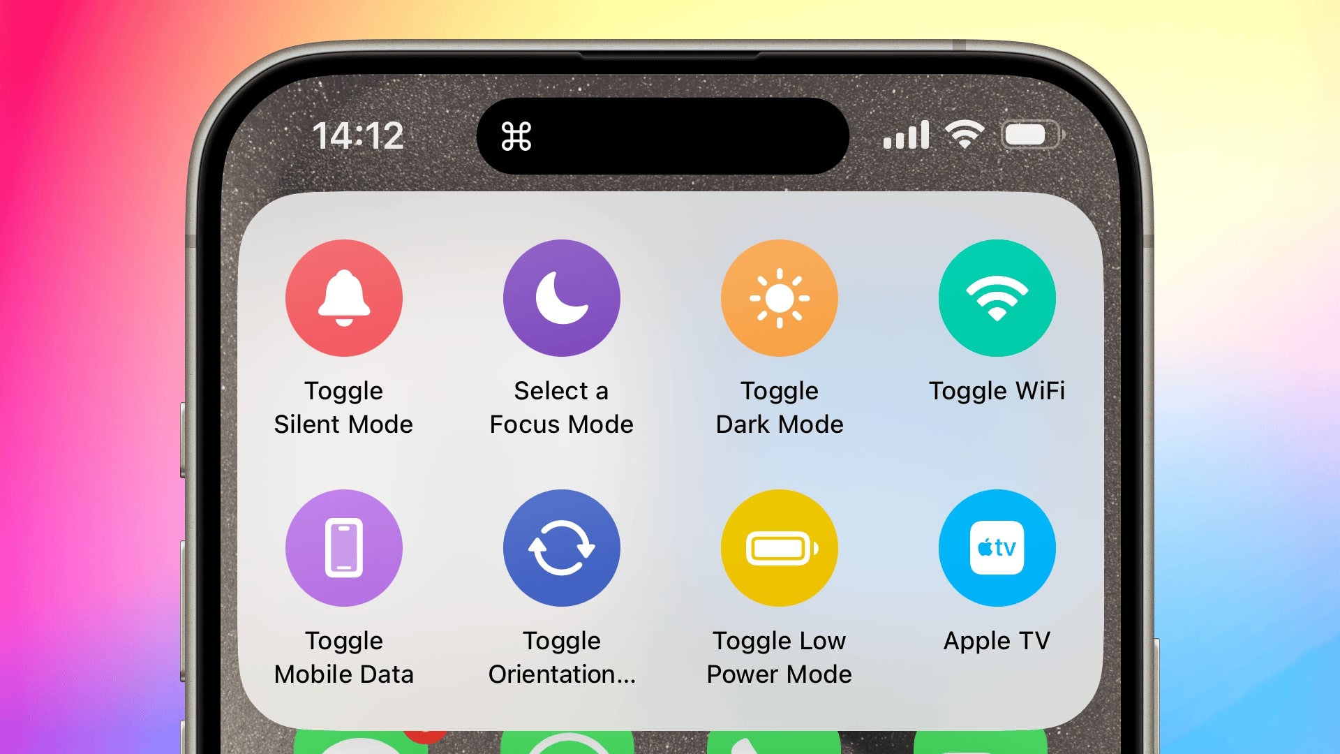
I’ve created a menu based on a hack I found on Reddit. It’s actually two Shortcuts – one to create the menu, and one to show the menu – to speed up how fast the menu can be shown.
I’ve used .vcf files – the format for saving contacts to your phone’s address book – to create the menu items. It basically works the same as any other Shortcuts menu; but they retain the iconography, making them more glanceable (for me, at least).

To create the menu, I first set up a folder of Shortcuts and populated it with everything I wanted to display in the menu. Each menu item triggers its own, unique Shortcut; so you need a unique Shortcut for each item.
When all the Shortcuts are made and in the folder, I run the “Save the Action Button Menu” Shortcut. This creates and saves a .vcf file to my iCloud Drive. Saving it to iCloud Drive is enables the menu to be synced across my devices.
When the Action Button is pressed, it runs a completely separate Shortcut called, simply, “Actions”. This Shortcut gets the .vcf file and displays it as a menu.
More complex, but faster
I could have combined these two things into one Shortcut; grabbing the Shortcuts from their folder, generating the menu on the fly, and then displaying it. Doing it that way actually enables mI found this was very slow because it had to generate the icons and each icon took a beat to process.
Separating out the creation of the menu from the running of the menu means there’s almost no delay in pressing the hardware Action Button and seeing the menu appear on screen.
Download the Shortcuts
If you want to use this set up, the two Shortcuts are available to download below.
- Shortcut icon
- Shortcut name
- Save the Action Button Menu
- Description
- Converts multiple Shortcuts to a .vcf file
- Type
- Apple Shortcut
- Download
- iCloud
- Shortcut icon
- Shortcut name
- Actions
- Description
- A Shortcut for displaying a .vcf file as a menu
- Type
- Apple Shortcut
- Download
- iCloud
Footnotes
Silent Mode. Just like the old switch, this toggles ‘Ring’ and ‘Silent’ modes. Instead of the satisfying thunk of a switch, you now you get distinctive, haptic feedback for each mode. ↩︎
Focus. To trigger a specific Focus mode, like Do Not Disturb. ↩︎
Camera. To open the Camera app, and in that app, take a photo. ↩︎
Torch. For blinding others whilst draining your battery accidentally fast. Seriously, go walk around your local area long enough and I guarantee you’ll spot some numpty that’s triggered their phone torch and not realised, and is walking around flashing it in everyone’s faces. ↩︎
Voice Memo. If you’re a Gen-X or Gen-Z type and have an alarming aversion to keyboards. ↩︎
Translate. For communicating in with those from other countries or, I suppose, species. ↩︎
Magnifier. For zooming in on things in the real world, or for cosplaying as a modern day Jessica Fletcher. ↩︎
Accessibility. Toggling any accessibility feature that is usually buried in the Settings app. ↩︎
I say almost anything because there are some glaring and frustrating omissions in the baked in Shortcut actions. For example, using a Shortcut I can toggle Silent Mode on or off; but I can’t detect whether silent mode is currently on or off. That means I can’t create
ifstatements like I might in a ‘real’ coding environment. App developers have stepped in to fill some of these gaps, but I’d rather not bloat my device with loads of helper apps. ↩︎
