Back in March, I added a new way to share music I’d been enjoying on my blog. This new post format was inspired by the iPod nano.
Whilst much of my website is pretty austere, these music posts were an opportunity to do something a bit more quirky. I’ve been leaning into that skeuomorphic aesthetic more since then.
Endlessly obsessed with futzing, I’ve decided to have a do-over with my early iPod experiment.
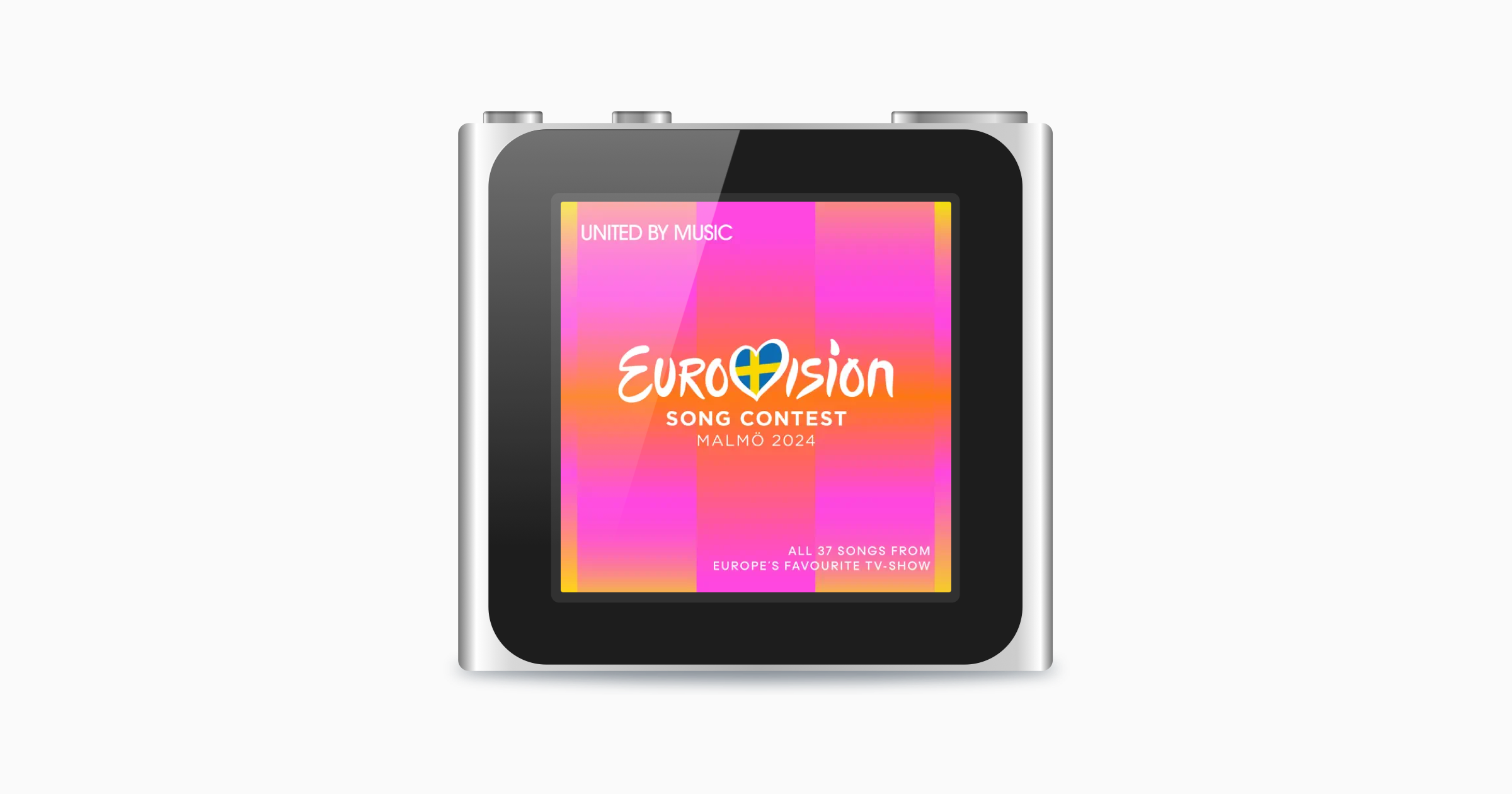
The original iPod nano posts looked like this…

This was based on a drawing from Wikimedia Commons. Separating that file into two layers – the device and the screen reflection – I then dynamically inserted artwork for whatever music I’m sharing in a re-usable, low effort way.
But it’s very ‘flat’.
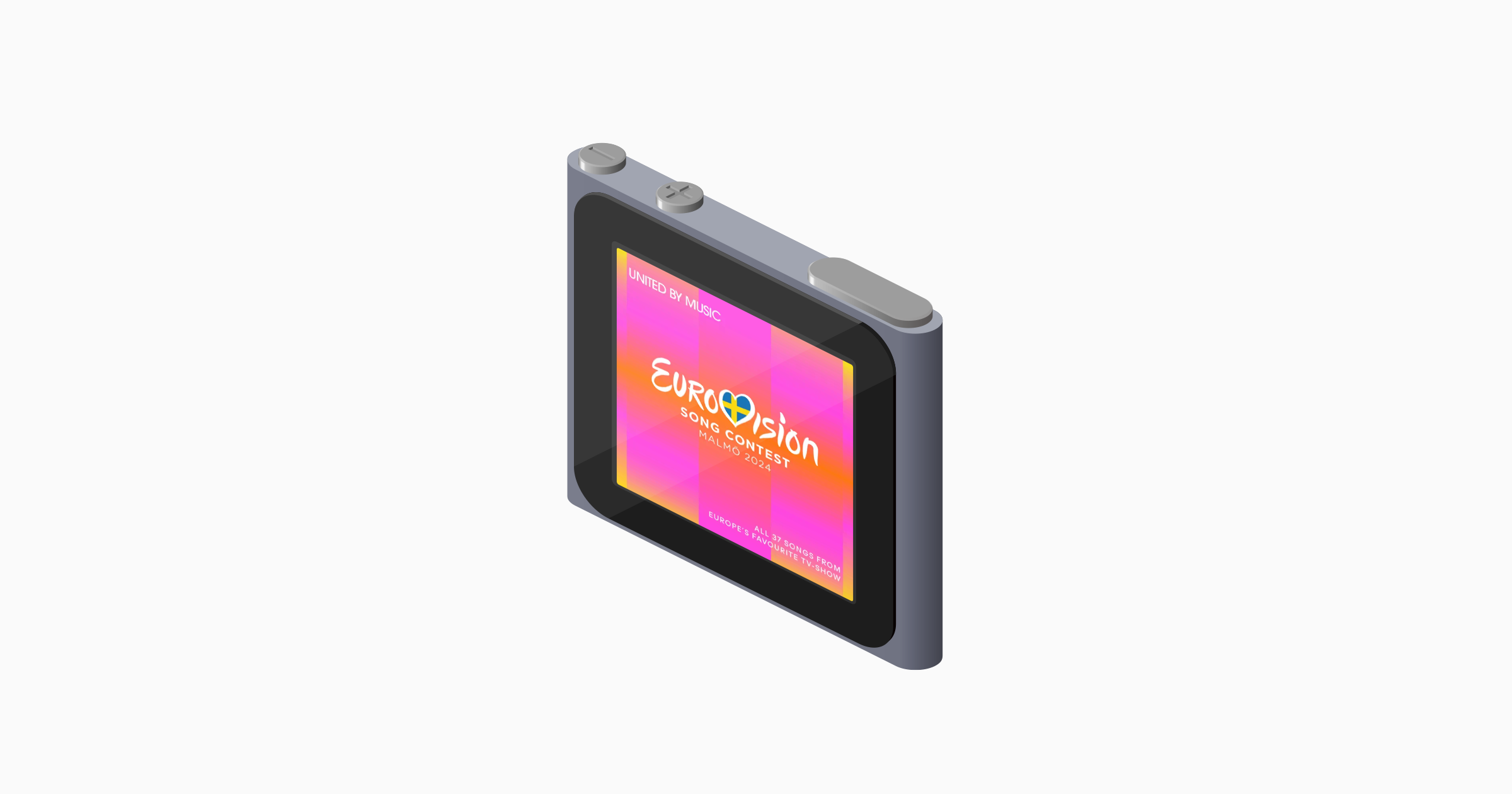
With my newer gaming-focused posts are more three-dimensional: I’ve created a Nintendo Game Boy Game Pak, in isometric projection and dynamically inserted the box art into the image. For this iPod nano do-over, I’ve tried to do the same thing. Now, the music posts look like this:

Harmless fun
This is a silly thing to have put into my website, but I think it’s more fun than just a picture and a title. And I think the isometric aesthetic is more fun than the 2D projection that came before it.
Check out all the iPods nano on my Music page.